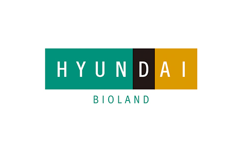
Hyundai Bioland Logo
CI
Below is the corporate identity (CI) of Hyundai Department Store Group and Hyundai Bioland.
 CI
CI
Corporate Identity of Hyundai Department Store Group
The CI of the Hyundai Department Store Group represents the present and future of the group.
Through its mission of “making happy customers and an abundant world,” it pursues a differentiated goal as a dignified brand most trusted by customers.
Wordmark & Color
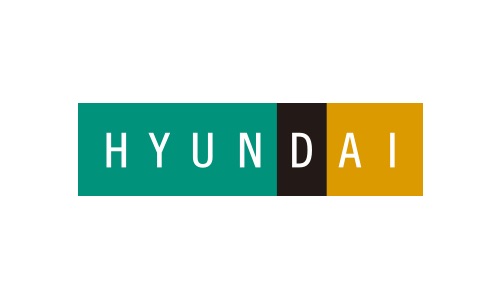
The shape and three colors of the wordmark of the Hyundai Department Store Group convey the following meanings: The emerald green on the left side of the CI represents Hyundai Department Store, with the dark yellow on the right denoting customers’ happiness. The black in the middle symbolizes high-class sense. In addition, the corporation on the left and customer on the right harmoniously meet at the center. The alphabet D in the middle represents “Dream of the Future.”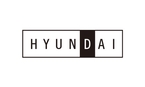
Logo Type
The logotype of the Hyundai Department Store Group conveys a firm, stable image as a high-class brand. It was created to maximize visibility and readability.Corporate Identity of Hyundai Bioland
The CI of Hyundai Bioland pursues the common value of the Hyundai Department Store Group and also conveys the message that the company creates abundant lives for all through cutting-edge technologies.
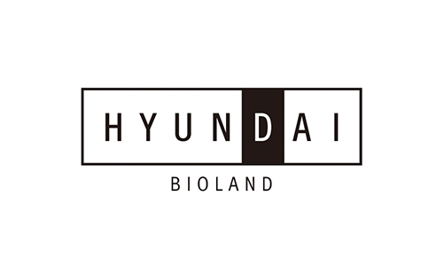
Signature Configuration Vertical